How can a programmer learn to design websites that don't suck
Graphics are really important in every project. Games, desktop apps, mobile app - every piece of software really - has something to gain by improving graphics (except Rogue, that is just awesome as it is). I’ve always felt like they were important but generally learning how to draw cool characters for a game is hard. So with the internet it all got much easier because I didn’t really have to know how to draw or color or anything. I could just type some CSS words, and things magically looked awful much faster than before! There are other advantages too, now I can see a good design, “view source” and get to know piece by piece what makes it good. We don’t have this kind of advantage with traditional drawings and user experiences.
So I started to look at things, and I saw what looked right and I tried to memorize it. When something looked great, instead of just moving along, I tried to analyze what it shared with other designs that also looked great. Sometimes I couldn’t quite put my finger on what it was, but with time you learn to deconstruct a couple of details and try to apply them on your own toy projects. From an artsy point of view I think this is awful because you’re just recycling stuff, but for a guy who had little sense of what colors looked well together and whatnot it was a big help and a good starting point. So I’ve come up with a personal set of rules for the web, which work for me and I believe could be helpful for other programmers that want to stop producing “programmer’s designs” and start just producing “designs”.
Start with a basic set of styling rules
Twitter bootstrap is very easy to grasp and the documentation is excellent. Just by adding a few classes on basic elements you get something simple that looks well.
Use as few visible elements as you possibly can
I’m talking about designs with boxes inside boxes inside a page section inside a container. These designs look well if you know what you’re doing, but most of the times you can get away with text on a white background or just a simple bordered container. I personally don’t really care about the number of elements on the source code. If the user doesn’t see them, it doesn’t matter if they’re there or not. Many times you hear people talking about “divitis” and so on. This doesn’t matter. Users don’t choose websites by div count and there’s no actual reason to make your life even harder. If adding a div with a class works, do it.
Align everything on the page and make sure its pixel perfect
Again, with something like bootstrap where you get a responsive grid, sizes and offsets just work. Either you use this or another system, stick to the grid and don’t go around absolute positioning stuff. It looks well where you’ve put it right now, it’ll look awkward in about 20 reloads. Stick to the grid.
Write the copy as soon as you can
Lorem ipsum is good filler text. It can also fool you into thinking things are looking okay when they aren’t. If you can write your copy right now, you’ll actually know how it will look and what changes you need to do. I would think that your design is a beautiful way to represent your message and not the other way around, so you should build your design around that message instead of changing the message to fit the design.
Black backgrounds are only cool on your terminal
The web is not a terminal or your favorite text editor. You won’t pull off a black background with green buttons. Use light colors and soft differences for highlights. A white background, a black text color, a link color and some other dominant color are enough for any website. If you need to highlight anything like a hover action or a click, don’t use a different color because you probably won’t know what looks well. Rather use a shade of that same color with a tool like 0to255. A few notches brighter or darker are enough for everything.
Build on top of previous designs
When you do something that doesn’t look well or just looks okay enough, don’t completely trash it. Make sure the skeleton structure is simple enough, and re-use it. When I designed stuff for the first time, after the first solid design I usually let it sit for a couple of weeks. After those, you already “know” the design, and you’ll be more comfortable editing it. I’ll give you an example of a toy project from last summer with the original design and an iteration:
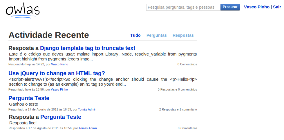
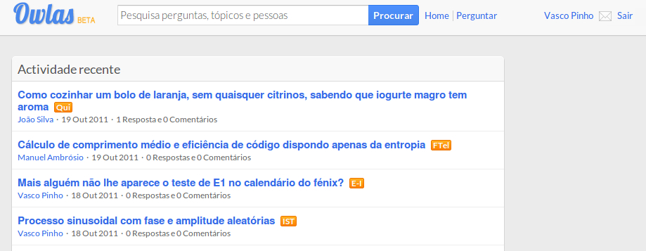
I personally feel the second version got more professional and organized. You can clearly see the first one followed the rules I enumerated. It was simple, white, and with few visible elements. Only after a couple of months did I get comfortable enough with the design to expand on it and reorganize things. Version 2 never actually got online because this was a summer project and, well, summer ended. But we did get lots of compliments on the simpleness of the design and how everything was intuitive.
Where these rules took me
This summer I actually decided to keep devoting some time to design. I enjoy programming but it’s much more fun to program things when you actually have an interface which doesn’t look like crap! Since I’ve been using twitter bootstrap as a starting point for a while now, I’ve kept doing that. To keep motivation up and have some kind of basic quality standard my goal was to make a few themes that would be good enough to sell. Enter wrapbootstrap. I found wrapbootstrap some time ago when it launched, and the designs there were ok. Nowadays the designs are much more polished and the quality has gone up tremendously. I decided to give it a go and started with a simple responsive landing page.
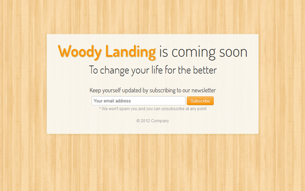
This allowed me to get the process straight and I also got into responsive design since those designs seemed to gather more interest (and sales!). It was only a landing page so I kept it simple and finished it quite quickly. I put it up and forgot about it. The day after they went live I got my first sale e-mail, I was ecstatic!
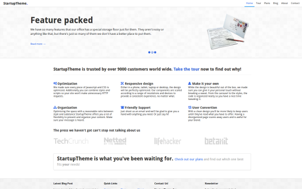
So I devoted some more time and started working on a full business type theme. And I got it done a couple of days later.
I’ve gotten a few sales on each of them which I consider a major win, since I’m actually a programmer posing as a designer. I answered some questions and received a bunch of suggestions from buyers. I think it is really awesome what you can achieve by just working on it. So my final advice for programmers who dismiss design work immediately saying they’ll never not suck is to just keep at it. Look at things from an analytical point of view. Deconstruct design and use the little bits that you like together, and eventually you’ll get to an acceptable level.
And once you’re rich you can hire someone who actually knows what they’re doing!